Mark Twain famously popularized the saying “Lies, damned lies, and statistics.” Statistics can be very persuasive, for good or evil purposes, but graphs representing statistics can be even more so.
I’m not implying that people deliberately produce terrible graphs, although some do seem to be pushing an agenda or two. In many cases, people just don’t know any better. Our technology doesn’t always help. The other day, I was attempting to graph some data in Excel, and the resulting automatically generated graph committed one of our major no-no’s: It did not begin the y-axis at zero. I had to click on the axis formatting to manually fix that.
So what are some major dos and don’ts for producing ethical graphs?
- Choose the right type of graph.
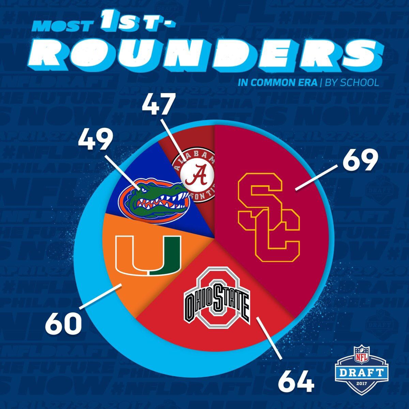
Hmmm, the last time I looked, pie charts usually represent percentages, and these should add up to 100, right? And it kind of looks like 60 is about half the size of 69?
2. Start Your Axes at Zero
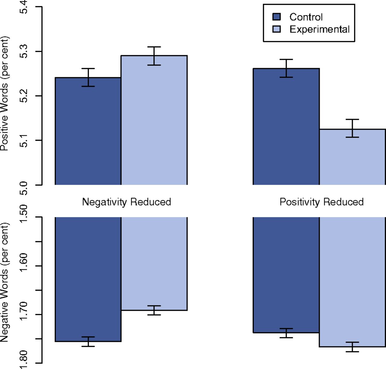
If you’re having trouble interpreting this one, you’re not alone. There are so many issues with this study–the Facebook Emotional Contagion Study–that frankly, this graph is the least of their problems.
But starting the y-axis above zero is a classic way to make things look more different than they really are. We’re looking at tenths to one-hundredths of a percent differences between the experimental and control groups in the number of positive or negative words used in status updates.
Also, it’s good practice to make both of your axes read from left to right. I realize the authors wanted to make the impact of fussing with the emotional tone of your newsfeed look like it was producing coordinated differences in the positive or negative words you use in your status updates, but this is largely unreadable. How would the data look if we fixed the scale?
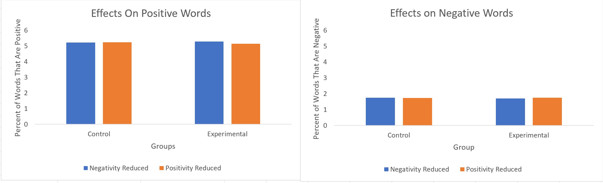
Even with this fix, we’re only looking at 6% or fewer of the words in participants’ status updates. What if we looked at the whole 100%?
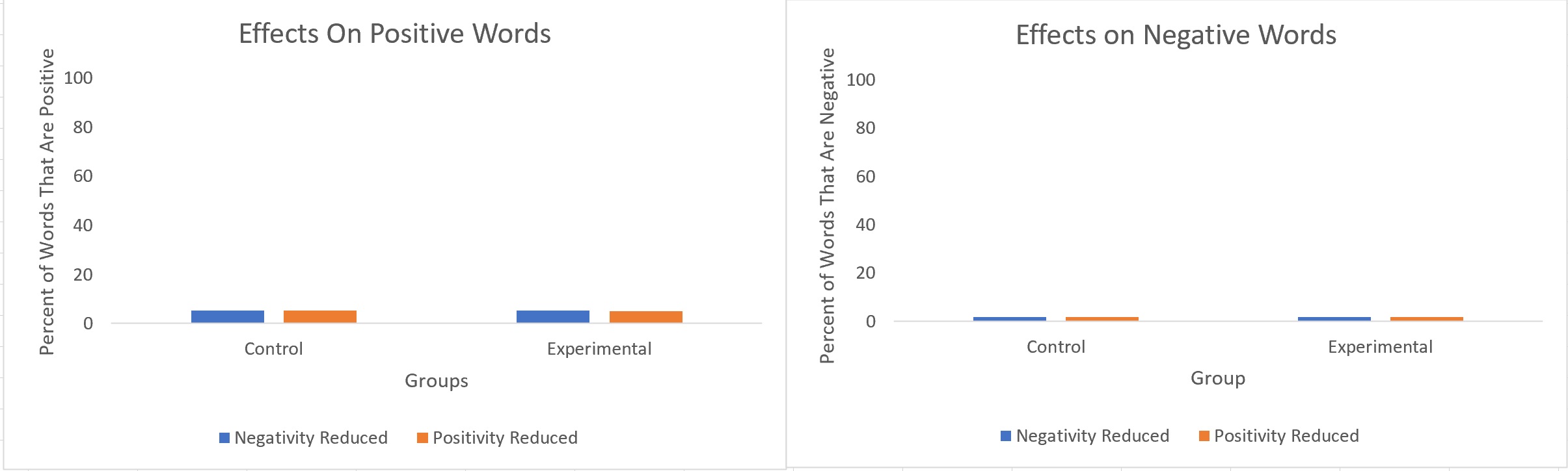
While we usually want to see a whole scale (see example below), there are times when this makes a graph unreadable. So this is a judgment call–show enough to make any differences apparent without inflating them.
This study is also a great example of a vastly overpowered (nearly 700,000 unwitting participants) study with statistically significant data and minuscule effect sizes. It definitely doesn’t pass the “so what” standard.
3. Choose a Scale That Fits Your Data
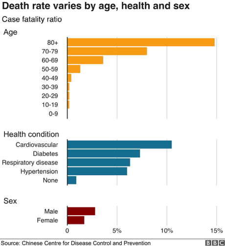
At the outset of COVID, March 1, the BBC published this graph, which makes things look very dire indeed for anyone 80 or older. It makes it look like nearly everyone over 80 who contracts COVID is going to die, but that’s not the case at all.
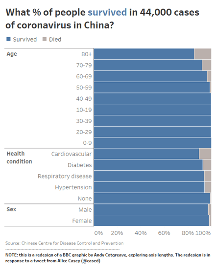
If you’re using percentages, well, show us the scale. I personally like this one from Andy Cotgreve of Tableau.
Tversky and Kahneman showed us that framing identical data as “people will die” versus “people will be saved” has a huge impact on public tolerance for risky solutions, such as destroying your economy. So the fact that the COVID data are always presented in the direst way by governments and their media outlets has a potentially huge effect on attitudes and behaviors.
4. Other Good Practices
In upcoming posts, I will try to expand on this one to cover some additional dos and don’ts: label everything, list your sources, avoid 3D, don’t cherry pick data (!!), show units, use color effectively, avoid chartjunk, and many more. Stay tuned!


0 Comments